How did you use media technologies in the construction and research, planning and evaluation stages?
To answer evaluation question 4 I created a short video giving an overview of the different media technologies used in the creation of our promotion package.
How effective is the combination of your main product and ancillary texts? For our coursework, me and the rest of my group decided that we would create a music video along with two ancillary tasks, a magazine advert and an album digipak. Overall I think that the combination of our music video, magazine advert and digipak is very effective. There are clear links throughout each to the artist of the song we chose, Madeon, and towards each other.
The main link that can be seen between all of our pieces of work is the urban/city location where we filmed the majority of the music video, and the silhouette that was created from a picture that I took of the London skyline, which has been incorporated into both of our ancillary tasks.
The use of a city skyline and urban environment is also very prominent in the previous music video and EP/single artwork and adverts and posters created to promote the music and tours of Madeon. We therefore wanted to incorporate this into our own work so that we could create an effective link between the promotional pack that we had created and Madeon's already existing products. We felt that using some of the imagery and graphics contained in his other material, such as fonts, colour schemes and size and positioning of the text would further help to create a consistent house style between the products, something that is key to creating and keeping a clear branding and image of the music artist. At first we created a version of our digipak that had all of the key features needed to create a clear link with the other products we had created, but there was a problem. Although we thought what we had created as a first draft was good, we quickly realised that it wouldn't be suitable as part of the promotional pack of an album from Madeon as we had missed out one of the key features that is included in all of his work, colour. Therefore we analysed his other single and EP covers and then incorporated the colour scheme into our final digipak.
There was a similar problem with the first draft of the magazine advert that we created. After looking at it after it was finished we realised that we had overused some colours, especially around the font in the middle and that we had included too much text. From our research we found that there is only a small amount of text, just giving small amounts of information that are very useful, but not too much so that the page becomes very busy. One other thing that we thought needed improving was the background which would look better plain black with just the coloured text above the city skyline silhouette instead of the Novation Launchpad design we had included. Therefore we removed some of the text, lightened some of the outer glows on the text in the middle, and generally made the whole advert cleaner and easy to look at.
In the video below you can see the clear links between the ancillary tasks that we created and the already existing artwork that is associated with Madeon and his music.
From our research we gathered that there is usually a clear link between the digipak for an album and the magazine advert for that album. One great example of this is for the album 'Lungs' by Florence and the Machine, which features the same picture of the lead singer Florence Welch on both. We used this idea in both of our ancillary tasks, and therefore included the same coloured diagonal text in both, the same font for the main title and other writing, and most importantly to link to Madeon and our music video, the London city skyline silhouette.
Overall we as a group are very happy with the overall finished music video, album digipak and magazine advert. I think that they all link to each other very well and would work well as a promotional tool for Madeon. There is nothing that I would change about the links between the three of them as I think they work perfectly together as a promotional pack.
In what ways does your media product use, develop or challenge forms and conventions of real media products?
For our A2 media studies project me and my partners chose to create a music video to the Netsky remix of the song 'Finale' by French artist Madeon. Along with the music video, we opted to create a magazine advert and the digipak for a new album.
Music Video
Through researching different music videos and looking at Andrew Goodwin's 'Dancing in the Distraction Factory we gained a great understanding of the forms and conventions of music videos, and what we needed to include in ours to make it a successful promotional tool for the artist.
From looking at other music videos within the electronic dance genre of music, we noticed that close ups of the artist or main protagonist feature frequently. We tried to include this convention within our music video as much as we could, without over-using it. The first shot of the chase scene of our music video features a close up of Dan being chased. This can be linked to many other music videos, especially the video to the song 'Sandstorm' by Darude, which we took a lot of inspiration from when planning our music video.
Some other examples of where we used close ups in our video are when the main character, Dan, wakes up from the dream. At this section of the music video we see close ups of him and the masked characters. Another example is the part where there is a close up of Dan trying to break open the gate as the masked characters close in on him.
After gaining feedback from our rough cut we begrudgingly decided to add a performance element to our video. This was a convention of nearly all music videos that we wanted to challenge, and leave out of our video as we thought that we could create a story that links well with the lyrics, pace and tempo of the song, to overall create an effective music video, but in the end we realised that only a small number of music videos can work well without performance, and these tended to be those with the inclusion of strange imagery or computer generated effects, such as the video for the song 'Pelican' by The Maccabees (see below).
Even videos that have a strong storyline such as the music video for the song 'Another Day' by Modestep feature an element of performace, and without it the video would be noticeably missing something. Therefore we decided to include the performance section into our video. We didn't, however, want to just add in a random clip of someone singing the lyrics of the song into our video, and instead we used Modestep's video as an example and incorporated the performance into the video by having Dan interacting with Josh in the recording studio before the chase starts. Another video that we looked at to see how performance can be added to a mainly narrative music video was one for the song 'Graduation' by Gemini. This also features cuts from the main part of the video to close ups of the artist singing the song and playing the piano, and this is what we tried to incorporate into our video with the shots of Josh in the recording studio. We felt that this adds to the overall finish and professional feel to the music video, and are now glad that we included it.
Another convention of music videos within the similar genre to the song we had chosen, and indeed all music videos was that the music is used to drive the editing. This was the main convention that we felt needed to apply to our music video and throughout we made sure that the visuals and pace of the cuts were fully in time with and backed up by the music.
The first example of the music driving the editing is the second shot of the video, which is cut to when the music starts. We edited the start of the music playing to be in time with Dan pressing the record button on the mixing desk. This gives the effect that he is starting the song, and it is a great establishing link between the visuals and the music.
Another example of where we have used the music to drive the editing is when Dan leaves the recording studio. Here we matched the door closing with the beat of the music. A similar effect to this is used in the music video to the song 'Show Me A Sign', also by Modestep where the drop of the music is used to show a major cut or event in the video, such as when the speakers come out of the ground towards the end of the boss fight scene.
My favourite instance in our music video where we have used the music to drive the editing is where we used very quick parallel cuts between Dan running as he tries to make his escape and the masked characters grabbing their jackets as they rush to leave the cinema/cctv office. This idea was recreated at the scene where Dan is trying to escape after being trapped at the gate. I feel that this effect has a great impact on the video, creating tension as the viewer wonders whether he will escape or not.
Another example of where we have used the music to drive the editing is a section where the music drastically changes pace. We cut from a shot shot of Dan panicking at the gate, which has a lot of movement, to the shot of Josh in the recording studio, which is much calmer and looks more relaxed. This matches fully with the change of pace of the music, and the slow motion used in the next few shots before the beat kicks in again help to enhance the link between the music and the visuals.
At the end of the music video when the chase has ended and Dan is confronted by the masked characters we added in an effect to make it look like they were suddenly jumping closer to him. We took this idea from the video to 'Chasin' by Sander Van Doorn and we created it by taking out small sections in the middle of the shot of the masked characters moving closer to Dan. It is very effective and can be a hint to our interpretation that Dan is in a dream and that they are beginning to break up as he wakes up. Here you can see the section of the Sander Van Doorn video that we got this idea from.
One final example of where we used the music to drive the editing is the final shot of the video where Dan wakes up to find that the whole thing was a dream. As he falls back we added in a blinking effect using cross dissolves that are synchronised with the notes played on the piano in the song. This is the last link between the music and the visuals before the final shot of the masked characters appearing once again before the fade to black at the end of the video.
Throughout the duration of the music video we made sure that we cut to the next shot in beat with the music to keep it flowing and make the editing seamless and un-noticeable. We also made sure that all of our locations matched up from shot to shot so that the continuity of the video was perfect. One of the hardest bits of continuity to keep was the wall jump part of the chase. In the rough cut of our music video we had filmed the masked characters running up the wall from ground level, and then cut to them running up the wall again but from above. This created some confusion with our audience as it looked like the same thing had happened twice. We therefore had to be very careful when editing this for our final cut as we wanted the jump to look seamless, and flow from shot to shot.
The continuity in the music video was a very important convention that we needed to make sure that we used multiple locations to give a sense of realism to the chase. We managed to include a variety of locations that fit in perfectly with the genre of music our song is from, within town/city/urban environments. The main reason for the large number of locations was based on research we did to other music videos featuring chase scenes, and by also looking at Madeon's only other music video. Below are the videos that we took this inspiration from.
The urban locations and environment also fit in with Madeon's general house style. On nearly all of his album covers and fan art a cityscape of Sydney skyline is featured . Therefore filming our music video in a city and using the skyline picture in our ancillary tasks made perfect sense and helped us relate to and promote the artist, which is the whole point of them.
We tried to match the clothing conventions for Dan by dressing him in a plain grey hoodie and a pair of jeans, similar to the clothes worn by the character in Sander Van Doorn's video 'Chasin'. Another example of the actors within a music video that is featured in the dance genre is the video to 'Feel so close' by Calvin Harris. You can see that everyone in the video is wearing casual clothing, even the artist Calvin Harris.
The masked men, however, were the most important people to get the clothing right for. The masks that they wear are clearly the most important item of them all, and they are a reference to the group Anonymous, who are a hacktivist group that want a free media landscape and strive to break the controls and sanctions of, in one instance the music industry. This is in complete contrast to our music video, where we have purposely reversed the role of the masked characters, making them the ones who are trying to control the artist.
The use of these masks within the music video for 'Toulouse' by Nicky Romero was slightly different to ours, but there are still some links that can be made between our video and his. The masks are used as a type of control similar to our video as they infect other people as soon as they wear one. One link that is very similar to our video is the end of the video where the man at the bus stop wakes up from what is seemingly a dream, yet the anonymous masks are still seen one last time in the very last shot of the video.
The matching uniform of our masked characters can also be linked to another video we took influence from, 'Sandstorm' by Darude. The actors chasing the main person in the Sandstorm video are both wearing matching uniforms. These both look good, but for our video we decided to add a more formal and official looking costume for our masked characters. Therefore we decided to use the grey suits with a white shirt and black tie, helping us to achieve this effect. Aswell as trying to gain this official look, we also wanted to link it back to Anonymous again, whose logo features a masked figure wearing a suit.
One final convention that we looked at when in the editing stages of our music video was the inclusion of a link to a institution that would broadcast the music video over the internet and on television. We had a list of options to choose from including 'Clubland TV', 'Dance Nation TV' and 'MTV Dance'. After doing some further research into these channels we realised that 'Dance Nation TV' does not broadcast on television anymore, and that 'Clubland TV' tends to feature songs that would be listed under the trance and house genres of music, not Dance like our song is listed as. Therefore the only option we had left was to use 'MTV Dance' as the channel to promote our music video on.We found the png of the MTV Dance logo and then made an animated song title bar on Adobe Photoshop. We made sure that the colour of the song title bar linked to the colour of the MTV logo, and then added them so that the logo was constantly visible in the top left corner of our video and the title bar appears at the beginning and end of the song.
Ancillary Tasks
When researching for our ancillary tasks we found out that the majority of dance music albums, similar to the videos, do not feature an image of the artist. They instead tend to include graphics and artwork rather than any photograph at all, which is something we wanted to include in our digipak. You can clearly see this from the examples on the right, which are the digipaks from albums within the dance music genre.
Another thing that influenced us towards using graphics on our magazine advert and digipak was the fact that on all previous artwork and EP covers from Madeon, there was no sign of a photograph, and instead just the either name of the artist or their logo and the name of the song/EP along with art work and graphics around it. We decided that for our digipak to promote the artist as well as possible it would have to link well to his previous artwork, and therefore we chose to keep along the same design lines to all of his previous covers. One of the main conventions of album digipaks and EP/single covers is that the name of the artist is nearly always larger than the name of the song or album, and is used to divert attention to the artist. We also wanted to keep our digipak simple and easy to look at, in a similar way to Madeon's other artwork.
As you can see, the front cover of the digipak continues the simple designs seen on all of his other artwork and features two main components:
The name of the artist and the album.
The silhouette of the London city skyline behind the text, which we created from a photo that I took in London. This links well with Madeon's other artwork, which features a silhouette of the Sydney skyline. It also links in well with the name of the album, 'The City' and the fact that we filmed the music video within the urban locations of Dartford and London.
We tried to make the inside covers of the digipak as simple as possible, yet still very effective. We included the city skyline silhouette on the top and bottom of the first inside page with just the coloured diagonal text filling the rest of the page. On the second inside page we included the 'M' and the name of the artist and album over the top of the disc. Around the outside of the disc is copyright information, which features on nearly every cd in an album digipak.
On the back page of the digipak we included the list of tracks in the centre of the page and added a vignette of the coloured text around the outside to make the track list stand out. Looking at other digipaks we also noticed that there is always the logo for the artist and his/her record label, along with copyright information and a barcode. Therefore we felt that these was necessary to include to make our digipak look like it was a real product.
We decided that our magazine advert should be as similar to our digipak as possible in terms of colour and graphics, and therefore felt that we needed to keep the colour scheme and fonts the same to keep a consistent house style between the products aswell as the use of the coloured text behind the silhouette of the London city skyline.
In order to do this we enlarged the city skyline silhouette and merged it with the black background to make it seem like the main part of the advert. We then added in the coloured diagonal text above the city silhouette and added the main titles and text to the main part of the advert, making sure that we used the same coloured text to keep the consistent house style between the products.
Finally we added a white bar to separate the main text from the star ratings, reviews and web links at the bottom of the page. These are key parts to an album advert as the reviews give the viewer an idea of whether the album is good or not and how they can find more of his work online, and is one of the main factors that helps to promote the artist.
When editing the rough version of our magazine advert ready for our final copy, we decided to remove some of the large text and include a QR code in the bottom right corner instead. This was down to fact that technology is now an integral part of the music industry and is becoming a key part in the promotion of music and artists. We noticed the QR code on an advert for the artist Goldfrapp and decided to include it seeing as it was something that more and more artists are starting to do with the introduction of new media technology.
Below you can see our magazine advert in pages 8 and 9 of DJ Mag, and as you can see, it fits in well and would not look out of place within a real music magazine.


 From our research we gathered that there is usually a clear link between the digipak for an album and the magazine advert for that album. One great example of this is for the album 'Lungs' by Florence and the Machine, which features the same picture of the lead singer Florence Welch on both. We used this idea in both of our ancillary tasks, and therefore included the same coloured diagonal text in both, the same font for the main title and other writing, and most importantly to link to Madeon and our music video, the London city skyline silhouette.
 From looking at other music videos within the electronic dance genre of music, we noticed that close ups of the artist or main protagonist feature frequently. We tried to include this convention within our music video as much as we could, without over-using it. The first shot of the chase scene of our music video features a close up of Dan being chased. This can be linked to many other music videos, especially the video to the song 'Sandstorm' by Darude, which we took a lot of inspiration from when planning our music video.
 Some other examples of where we used close ups in our video are when the main character, Dan, wakes up from the dream. At this section of the music video we see close ups of him and the masked characters. Another example is the part where there is a close up of Dan trying to break open the gate as the masked characters close in on him.


 The urban locations and environment also fit in with Madeon's general house style. On nearly all of his album covers and fan art a cityscape of Sydney skyline is featured . Therefore filming our music video in a city and using the skyline picture in our ancillary tasks made perfect sense and helped us relate to and promote the artist, which is the whole point of them.
 The use of these masks within the music video for 'Toulouse' by Nicky Romero was slightly different to ours, but there are still some links that can be made between our video and his. The masks are used as a type of control similar to our video as they infect other people as soon as they wear one. One link that is very similar to our video is the end of the video where the man at the bus stop wakes up from what is seemingly a dream, yet the anonymous masks are still seen one last time in the very last shot of the video.
 The matching uniform of our masked characters can also be linked to another video we took influence from, 'Sandstorm' by Darude. The actors chasing the main person in the Sandstorm video are both wearing matching uniforms. These both look good, but for our video we decided to add a more formal and official looking costume for our masked characters. Therefore we decided to use the grey suits with a white shirt and black tie, helping us to achieve this effect. Aswell as trying to gain this official look, we also wanted to link it back to Anonymous again, whose logo features a masked figure wearing a suit.
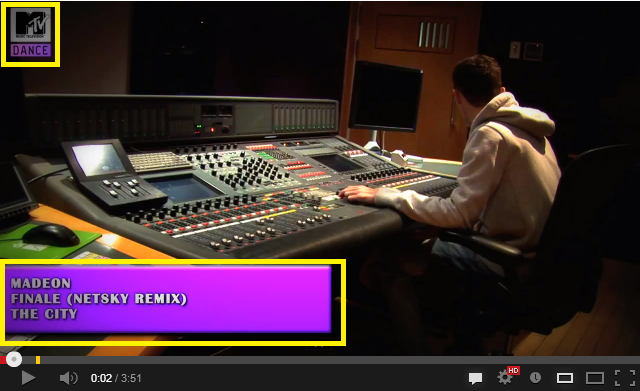 One final convention that we looked at when in the editing stages of our music video was the inclusion of a link to a institution that would broadcast the music video over the internet and on television. We had a list of options to choose from including 'Clubland TV', 'Dance Nation TV' and 'MTV Dance'. After doing some further research into these channels we realised that 'Dance Nation TV' does not broadcast on television anymore, and that 'Clubland TV' tends to feature songs that would be listed under the trance and house genres of music, not Dance like our song is listed as. Therefore the only option we had left was to use 'MTV Dance' as the channel to promote our music video on.We found the png of the MTV Dance logo and then made an animated song title bar on Adobe Photoshop. We made sure that the colour of the song title bar linked to the colour of the MTV logo, and then added them so that the logo was constantly visible in the top left corner of our video and the title bar appears at the beginning and end of the song.
 When researching for our ancillary tasks we found out that the majority of dance music albums, similar to the videos, do not feature an image of the artist. They instead tend to include graphics and artwork rather than any photograph at all, which is something we wanted to include in our digipak. You can clearly see this from the examples on the right, which are the digipaks from albums within the dance music genre.
