Tuesday, 5 February 2013

Digipak Research - Josh

As part of our coursework we needed to design a digipak for our music video. This first consisted of researching album cover art in our particular genre (Dance/House). The first ones I looked at were the ones that consisted largely of graphics as opposed to one photograph. Below are some of the albums by Drum and Bass band: Pendulum.
http://www.callupontheauthor.com/blog/wp-content/uploads/2010/08/pendulum-immersion-album-art1.jpghttps://blogger.googleusercontent.com/img/b/R29vZ2xl/AVvXsEiNfznAPEV5VP0rz03-51EOksHes_xehNDYdnw8oje03UF9VzGF8ZVThi5A8N5Ruso59D9cO3SAFGK7Wv7nKDoGTNJ9XqoX4uUNQBcwdysEtKbWMtTyqvLGINiPHEAgBxRzOXbp1Jm04KG-/s1600/Pendulum+-+Hold+Your+Colour.jpg
 Despite the album art using some pictures (that of the eye in 'Hold Your Colour' and the fish in 'Immersion') the art relies heavily on graphics that surround and emphasise these photographs. I personally really like these album covers as they look stunning and are an illustration of how we are able to create beautiful art simply with a few pictures and photoshop.

 The album name 'Immersion' directly relates to the album art, for a man and a woman are submersed in the sea among many other sea creatures. The intricate and detailed art is also meant to 'immerse' us in the sense that we are drawn in by it.
 'Hold Your Colour' could have a possible relation to the cover as it is made up of many different colours and shades, as well as colour being directly drawn from the eye, which is made to draw our attention, eyes being a focus of many different types of art.
'In Silico' is actually an expression used to mean "performed on computer or via computer simulation", which relates to the computer-generated graphics on the album cover, and could have possible connotations regarding what seems to be a fetus enclosed within an egg with sperm encircling it. This could refer to how Pendulum see their work (the album) as their child, the importance they hold to it and how they have created this through computers. We can draw a comparison between 'Immersion' and 'Hold Your Colour' in the sense that they feature original images that have been heavily manipulated to enhance them, whereas 'In Silico' makes use of simpler graphics. There is a continued house style through the covers as they all make use of heavily edited computer graphics to create the covers but there is perhaps no obvious correlation between the three, i.e. no band members are featured or the same font being used.


 There is no prevalent font through the three albums, and although they do bear resemblance to one another, there appears to be no brand recognition in that respect.
  As you can see from the inside design of 'Hold Your Colour', the concept of the stream of light coming out of the eye is continued on from the cover. This also applies for the song list on the back panel. Light is also shown bursting out of a pair of hands on the design behind the CD, very similar to that of the eye and surrounding inside design. The whole design of the panels uses a similar, dark background with a green, blue and pink/purple colour palette, using white against solid black for the font so it stands our easily.
 'Hold Your Colour' was the main inspiration behind this single (Witchcraft) cover art, the use of the eye being the most noticeable feature they chose to centre both pieces on. Again, this has been heavily edited, perhaps even the eye isn't an original photograph. The reason I believe this looks much more like a single cover art rather than a whole album is because there is only one centre-point for the viewer to look at, this being the eye, which takes up a lot of the whole image with there being little else to be looked at. This differs from 'Hold Your Colour' in the sense that, despite the eye being the main focus-point, it is much smaller than the 'Witchcraft' eye and features more around the whole cover such as the roots around the eye and the bubbles rising up through the title.
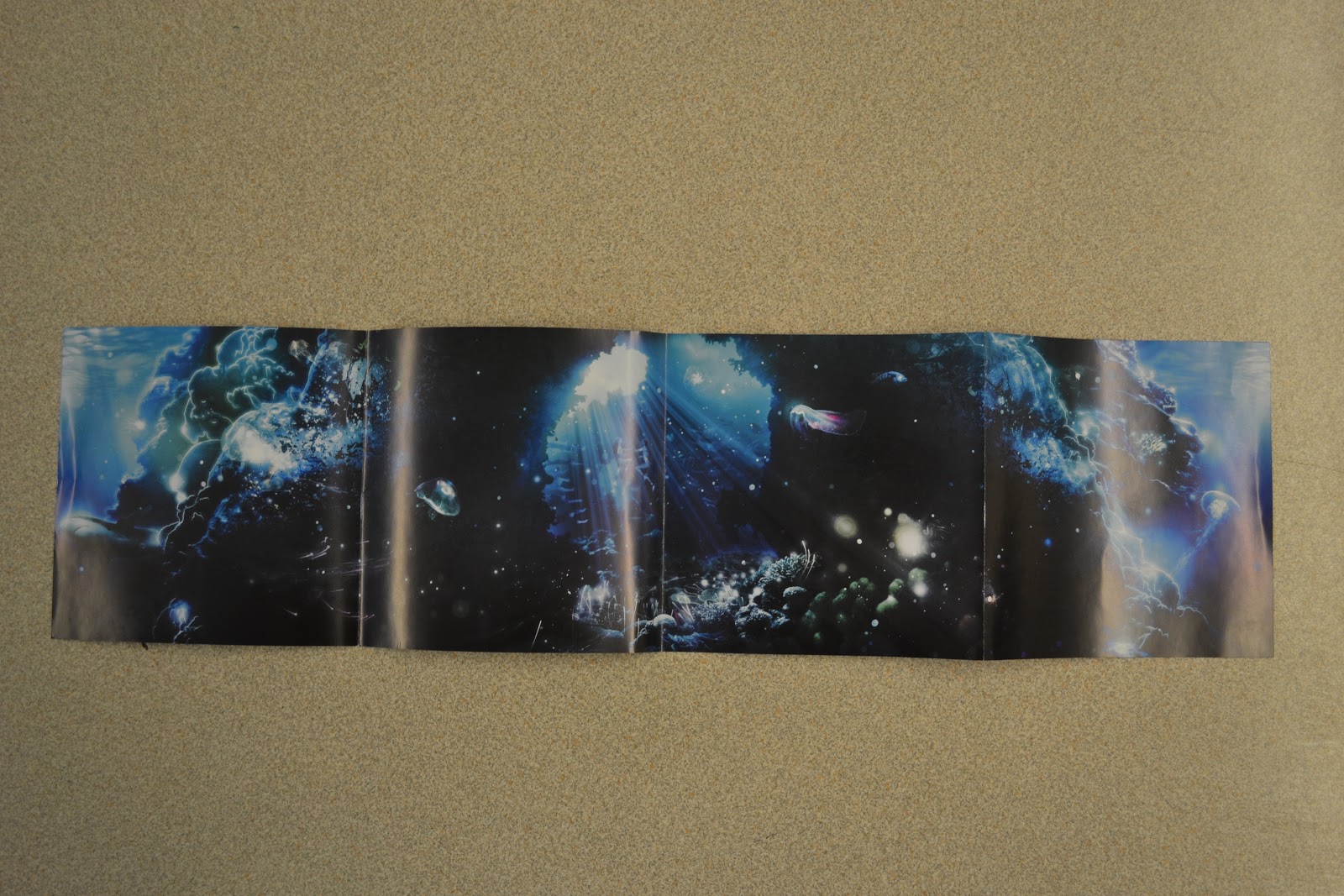
  The inside art for 'Immersion' bears similar resemblance to the cover; behind the CD it looks like an empty space underwater which the CD fills up. On the left side you can see the 'thank you's' which consists of a lot of text, thus being the reason the background is kept simple with solid black and only a couple of graphics added in.
  The song list on the right panel above compare very strongly, for the colour palette of black and blue as well as pink/purple are carried on from the front cover. The font for the songs is the same as the album title on the front. There remain some sea creatures as well as beams of blue light from above the water along with coral amongst other rocky features along the bottom, which all feature on the cover.
 The CD art uses original images for the bubbles as well as the jellyfish. This bears strong resemblance to the other four panels as it is underwater, uses black and blue for the colours and the use of the bubbles is meant to emphasise that the viewer has just been 'immersed', thus also emphasising the album title.
http://soundisstyle.com/wp-content/uploads/2012/09/until-now-cover.jpghttp://fanart.tv/fanart/music/99075985-0d80-4692-a15e-b16f78831792/albumcover/until-one-4e421c7cc3fe8.jpg
 The album art above by House supergroup Swedish House Mafia is of their two albums: Until One and Until Now. Their first album (Until One) features a very simple design with formal serif text which could be representative of their plain and formal nature. Until Now on the other hand features the three band members with their iconic three circles behind their heads, perhaps striking a resemblance to the circular halos found behind Jesus Christ's head in pictures of him.
 The electronic group Nero's only album 'Welcome Reality' features futuristic graphics accompanied by the name with their unique font spread across the cover. This is typical of albums; to have the artist name in the centre of the page which becomes the main focus of the art, especially considering the artist's name is far larger than the album name (artist promotion and recognition). It also bears some resemblance to a film poster or DVD cover due to the credits at the bottom of the cover. It seems appropriate for an electronic/house group such as Nero to encorporate futuristic graphics in their cover art, since this genre often makes use of the fact that it seems modern and advanced compared to other genres.


 A possibly more mainstream dance producer, Calvin has had 3 albums, with his most recent one '18 Months' reaching number 1 in the charts. His first album makes relatively simple use of a photograph of Harris edited to give it a cartoon effect. I believe this album art to be quite effective as although it is simple, it stands our quite well, yellow and black contrasting quite differently. It does however still retain a certain techno/dance appeal with the digital font. The second album has some continuity from the first one as the picture has the same 'light-filled' glasses along with the same font. The woman along with the glasses add glamour to the art, possible a metaphor to the album title 'Ready for the Weekend', implying going out to clubs and parties, which seems appropriate since Harris's dance music is very popular amongst clubs. His latest album contrasts highly from his first two, since it doesn't feature a facial close up or the glasses, as well as the text instead featuring prominently in the middle of the cover instead of the to the side. It is, however, another relatively simple album art, with an unedited photograph with Harris sitting on the pavement, which could be described as untypical of dance album covers. An interesting aspect of this album cover is that the background features in Harris's music video for his single 'Bounce'. This is very uncommon in not just dance digipaks but also for all digipaks of every genre, since the album is a collective of lots of singles and isn't just based around one. Harris possibly decided to use this for the digipak cover as artists often want to add in a personal touch to their covers (it being a work of their art), and he may feel that the music video for 'Bounce" relates to his life or bears some resemblance to it.


Monday, 4 February 2013

Final Cut - Peer Feedback - Group

During one lunch time at school all of the media students watched everyone's music videos and gave them feedback on what they liked didn't like.

In the padlet below you can see all of the feedback that my group received on the final cut of our music video.


Sunday, 3 February 2013

Friday, 1 February 2013

Thursday, 31 January 2013

Filming Day 8 - Stone House - Luke

31/1/13

On the 30th January we were planning on re-filming our car park confrontation scene between Dan and the masked characters. As we got to the car park we spent about 15/20 minutes planning out our shots and were very confident that we would come out with a lot better footage than we got on the first time filming in the car park. There was, however, a problem. Just after we had set up the camera and were ready to film our first shot, security and management of the car park came up and told us that due to the car park being private property we were unable to film there and therefore had to leave.

We then spent the rest of the day thinking about other possible locations that we could film our confrontation scene, and with time and light running out, it was looking like we wouldn't be able to film. We did, however think of an industrial estate that was close to us that might have looked good for the scene, but after getting there and scouting the location we realised that it wouldn't be a suitable location to film in, mainly because of the large amount of vehicles in the area and the lack of a place where Dan could be cornered or trapped.

After more discussion we decided that the next day (31st January) we would go to 'Stone House', which is an abandoned mental asylum, to try and film the shots. When we arrived at Stone House we scouted the location for just under an hour, looking for suitable places for Dan to be trapped. One idea we had was that Dan could run up to the door of the old house, which would be locked, but realised it would look too easy for him to escape, not creating the tension that we wanted.


We then found another area on the grounds of the asylum that we thought would work perfectly; a ramp with rails on either side that led up to a wooden gate. We had the idea that Dan could run up to the gate and try to open it, only to find out that it was locked. We then planned to get Josh and Phil walking up the ramp towards Dan, appearing the think they have him trapped. Then, to link in with the lyrics 'brace yourself for the grand finale', Dan would jump over the rail followed by Phil and Josh who start chasing him again.

We recorded this from a variety of different angles, getting close ups of Dan as he panics trying to open the gate and a still shot of the masked characters approaching Dan. Once we had finished and watched back the shots we had filmed we were very happy, and thought that they would work well within our music video, even thought they were different to the car park scene that we had originally planned.

Over the past week of filming we are very happy and feel that we can now go on to construct a professional looking music video for the song 'Finale'.

Sunday, 27 January 2013

Filming Day 7 - Deluxe 142 Re-Filming - Luke

26/1/13

After receiving feedback and deciding upon what action we wanted to take (can be seen here), we returned to Deluxe 142 to film some of the new ideas we came up with for our video. When we arrived my dad showed us a range of different recording studios before we decided on the main one we were going to use. The one we eventually picked was chosen because of the separate recording booth and the large recording desk, which we thought would give our video some professionalism.

The first shot we filmed in the recording studio was of Josh singing. We played the song through James' phone so that Josh could get the lip sync perfectly in time. We filmed him singing the song three times from three different angles so that we had a variety of footage to use for the parallel cuts between the chase scene and Josh in the recording studio.

Next we filmed the section where Dan takes the disc and leaves the studio, before giving Josh the signal that the song had started recording. We filmed this section from a variety of different angles and positions. Upon looking back at the footage we found that these shots look very good and the new re-filmed introduction will fit in well with our music video.

After filming the intro we immediately started to plan and film our shots for the end of the video, which features Dan being chased through the door into the studio and falling back on the couch. The shot of Dan falling back on the couch proved extremely hard to get right, as many times the fall looked un-natural and faked. In total we took around seven takes to get it right. James then filmed the POV shots of Dan falling back on the sofa and waking up from his dream, completing the filming in the recording studio.


The last footage that we needed to record was back in the cinema. We needed to re-film one of the shots, which included me standing in the corner of the shot turning on the lights, something we had not noticed on the first time of filming. This time we made sure that this would not be repeated and instead of me standing at the light switch waiting to turn them off, we got a remote that would turn them off with the simple push of a button, meaning that there was no risk of me or anyone else being in shot. We are happy we the footage that we re-filmed for the beginning and end of our video, and are now slightly happier with the idea of using performance within our video.

Tuesday, 15 January 2013

Responding to feedback - Group

After receiving feedback from both our peers and our teacher, we needed to decide what changes we had to make in order to make our final cut as good as possible. One of the main points our teacher advised us to change was to include an element of performance into the video in order to make it more believable as a real music video.
We could understand how this would make the music video look more professional, but it gave us the problem of finding someone who would look good in our video as the vocal artist, feel comfortable being filmed singing, and also the problem of finding a way to fit in the clips of the artist singing with the other shots in our music video. After a lot of discussion and considering many different people we decided that Josh would be the perfect person to take up this role in the video.  Him being the vocal artist as well as one of the security guards wouldn't be a problem either as the mask would cover up his identity and nobody would be able to see that they are the same person.
After deciding that josh should be the person who performs the vocals within the video we now had to turn our attention to the other parts of our rough cut that weren't so good. Based on the feedback we received and our own opinions on the video, we decided that we would be better off changing the idea behind the music video, and refilming both the beginning and end. This was mainly because we ourselves felt the these sections were not as strong as they could have been, and also because of some of the feedback we received regarding the acting in a couple of scenes. There was also the problem with the lighting in the confrontation part of the video, taking place in the car park. This section needed to be totally refilmed aswell. Looking at what we needed to refilm we became slightly worried that we may not be able to fit in all of the filming within the time that we had, although after a bit of thinking we realised that we would be able to refilm the sections in a relatively short amount of time as most of our shots could be filmed within one place, the editing suites and sound studios at Deluxe 142.
All three of us went home and tried to think up some alternative starts and endings to the video over the weekend. This proved a tough thing to do, and the only idea that was reasonably easy to film, and would work well within the video was an idea that James came up with. He suggested that the video should start in one of the recording studios with Dan acting as the music producer/DJ instead of a thief. Josh could be introduced to the video at this point as being the artist in the vocal booth. Dan would then hit record and josh would start singing as the lyrics of the song come in. As he hits record he would eject another disc, giving the idea that it is a song that he has previously recorded, and that he has taken it in order to keep hold of it and stay in control of his music. This idea of artists wanting to keep control of their music and stop it being changed by record labels in order for it to cater for the mainstream can be seen within many music videos. One example of this is in the music video for the song 'Show Me A Sign' by Modestep where four girls seemingly being the Charlie's angels of the music industry are sent out to 'destroy all commercial music'.