As
part of our coursework we needed to design a digipak for our music
video. This first consisted of researching album cover art in our
particular genre (Dance/House). The first ones I looked at were the ones
that consisted largely of graphics as opposed to one photograph. Below
are some of the albums by Drum and Bass band: Pendulum.


Despite the album art using some pictures (that of the eye in 'Hold
Your Colour' and the fish in 'Immersion') the art relies heavily on
graphics that surround and emphasise these photographs. I personally
really like these album covers as they look stunning and are an
illustration of how we are able to create beautiful art simply with a
few pictures and photoshop.
The album name 'Immersion' directly relates to the album art, for a man
and a woman are submersed in the sea among many other sea creatures.
The intricate and detailed art is also meant to 'immerse' us in the
sense that we are drawn in by it.
'Hold Your Colour' could have a possible relation to the cover as it is
made up of many different colours and shades, as well as colour being
directly drawn from the eye, which is made to draw our attention, eyes
being a focus of many different types of art.

'In
Silico' is actually an expression used to mean "performed on computer
or via computer simulation", which relates to the computer-generated
graphics on the album cover, and could have possible connotations
regarding what seems to be a fetus enclosed within an egg with sperm
encircling it. This could refer to how Pendulum see their work (the
album) as their child, the importance they hold to it and how they have
created this through computers. We can draw a comparison between
'Immersion' and 'Hold Your Colour' in the sense that they feature
original images that have been heavily manipulated to enhance them,
whereas 'In Silico' makes use of simpler graphics. There is a continued
house style through the covers as they all make use of heavily edited
computer graphics to create the covers but there is perhaps no obvious
correlation between the three, i.e. no band members are featured or the
same font being used.
There is no prevalent font through the three albums, and although they
do bear resemblance to one another, there appears to be no brand
recognition in that respect.
As you can see from the inside design of 'Hold Your Colour', the
concept of the stream of light coming out of the eye is continued on
from the cover. This also applies for the song list on the back panel.
Light is also shown bursting out of a pair of hands on the design behind
the CD, very similar to that of the eye and surrounding inside design.
The whole design of the panels uses a similar, dark background with a
green, blue and pink/purple colour palette, using white against solid
black for the font so it stands our easily.
'Hold Your Colour' was the main inspiration behind this single
(Witchcraft) cover art, the use of the eye being the most noticeable
feature they chose to centre both pieces on. Again, this has been
heavily edited, perhaps even the eye isn't an original photograph. The
reason I believe this looks much more like a single cover art rather
than a whole album is because there is only one centre-point for the
viewer to look at, this being the eye, which takes up a lot of the whole
image with there being little else to be looked at. This differs from
'Hold Your Colour' in the sense that, despite the eye being the main
focus-point, it is much smaller than the 'Witchcraft' eye and features
more around the whole cover such as the roots around the eye and the
bubbles rising up through the title.

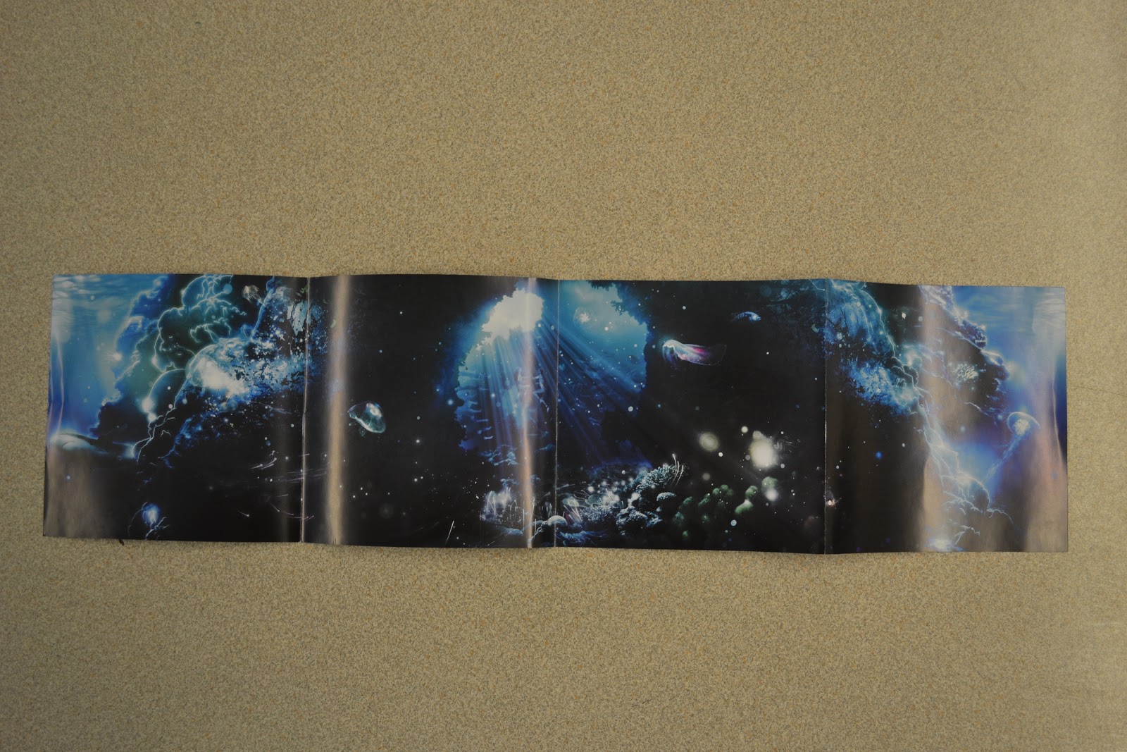
The inside art for 'Immersion' bears similar resemblance to the cover;
behind the CD it looks like an empty space underwater which the CD
fills up. On the left side you can see the 'thank you's' which consists
of a lot of text, thus being the reason the background is kept simple
with solid black and only a couple of graphics added in.
The song list on the right panel above compare very strongly, for the
colour palette of black and blue as well as pink/purple are carried on
from the front cover. The font for the songs is the same as the album
title on the front. There remain some sea creatures as well as beams of
blue light from above the water along with coral amongst other rocky
features along the bottom, which all feature on the cover.
The CD art uses original images for the bubbles as well as the
jellyfish. This bears strong resemblance to the other four panels as it
is underwater, uses black and blue for the colours and the use of the
bubbles is meant to emphasise that the viewer has just been 'immersed',
thus also emphasising the album title.


The album art above by House supergroup Swedish House Mafia is of their
two albums: Until One and Until Now. Their first album (Until One)
features a very simple design with formal serif text which could be
representative of their plain and formal nature. Until Now on the other
hand features the three band members with their iconic three circles
behind their heads, perhaps striking a resemblance to the circular halos
found behind Jesus Christ's head in pictures of him.

The electronic group Nero's only album 'Welcome Reality' features
futuristic graphics accompanied by the name with their unique font
spread across the cover. This is typical of albums; to have the artist
name in the centre of the page which becomes the main focus of the art,
especially considering the artist's name is far larger than the album
name (artist promotion and recognition). It also bears some resemblance
to a film poster or DVD cover due to the credits at the bottom of the
cover. It seems appropriate for an electronic/house group such as Nero
to encorporate futuristic graphics in their cover art, since this genre
often makes use of the fact that it seems modern and advanced compared
to other genres.


A possibly more mainstream dance producer, Calvin has had 3 albums,
with his most recent one '18 Months' reaching number 1 in the charts.
His first album makes relatively simple use of a photograph of Harris
edited to give it a cartoon effect. I believe this album art to be quite
effective as although it is simple, it stands our quite well, yellow
and black contrasting quite differently. It does however still retain a
certain techno/dance appeal with the digital font. The second album has
some continuity from the first one as the picture has the same
'light-filled' glasses along with the same font. The woman along with
the glasses add glamour to the art, possible a metaphor to the album
title 'Ready for the Weekend', implying going out to clubs and parties,
which seems appropriate since Harris's dance music is very popular
amongst clubs. His latest album contrasts highly from his first two,
since it doesn't feature a facial close up or the glasses, as well as
the text instead featuring prominently in the middle of the cover
instead of the to the side. It is, however, another relatively simple
album art, with an unedited photograph with Harris sitting on the
pavement, which could be described as untypical of dance album covers.
An interesting aspect of this album cover is that the background
features in Harris's music video for his single 'Bounce'. This is very
uncommon in not just dance digipaks but also for all digipaks of every
genre, since the album is a collective of lots of singles and isn't just
based around one. Harris possibly decided to use this for the digipak
cover as artists often want to add in a personal touch to their covers
(it being a work of their art), and he may feel that the music video for
'Bounce" relates to his life or bears some resemblance to it.


 One of the first things that I looked at was the poster for Madeon's first tour. As you can see, there are a lot of bright colours surrounding his name, there is a clear and easy to read layout of text, and there is a banner at the bottom listing his social network web addresses and his record labels. There is also the inclusion of a picture, seemingly of an urban, city environment similar to the one seen in his music video to the song 'The City'.
 Looking at some of his digipak covers for his previous EPs and singles, I noticed that there are a lot of links between them.
 Firstly, you can see that there font used in all pieces is the same, as is the colour scheme used in and around the font. This is used to create a consistent house style between all of the products, and helps to create a consistent brand/image that can be related to Madeon. This is something that will be key to include in both of our ancillary tasks in order for them to be part of a successful promotional park for Madeon's new album.